Learn how to integrate Apollo with HubSpot step by step. Growth's guide covers field mapping, lead enrichment sync, and automated outreach...
Read More
This article breaks down post-launch best practices and how Growth uses hypercare as a dedicated stabilization period immediately following...
Read More
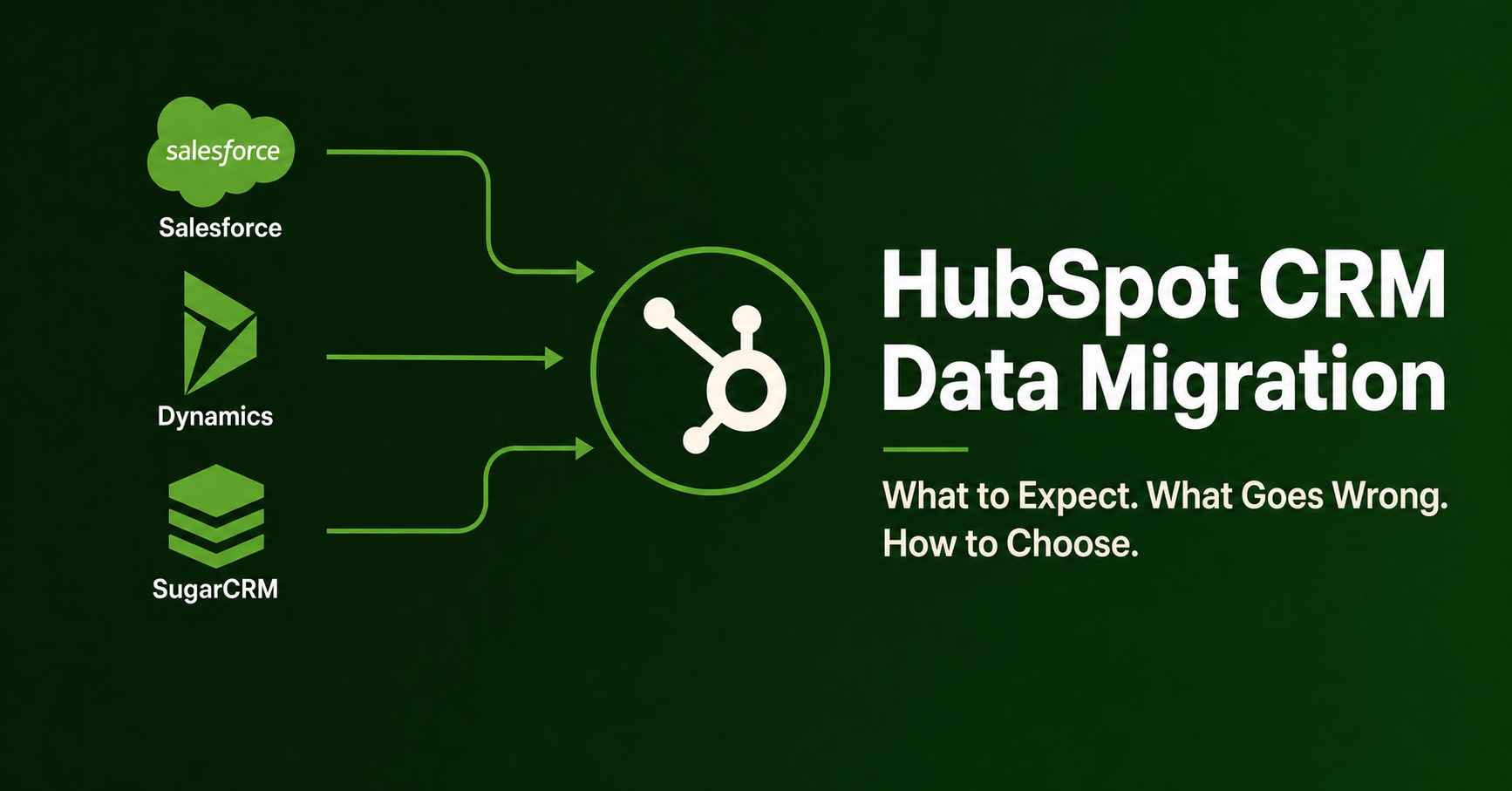
This article covers what a well-run migration actually involves, what HubSpot's CRM Data Migration Partner Accreditation program tests for,...
Read More
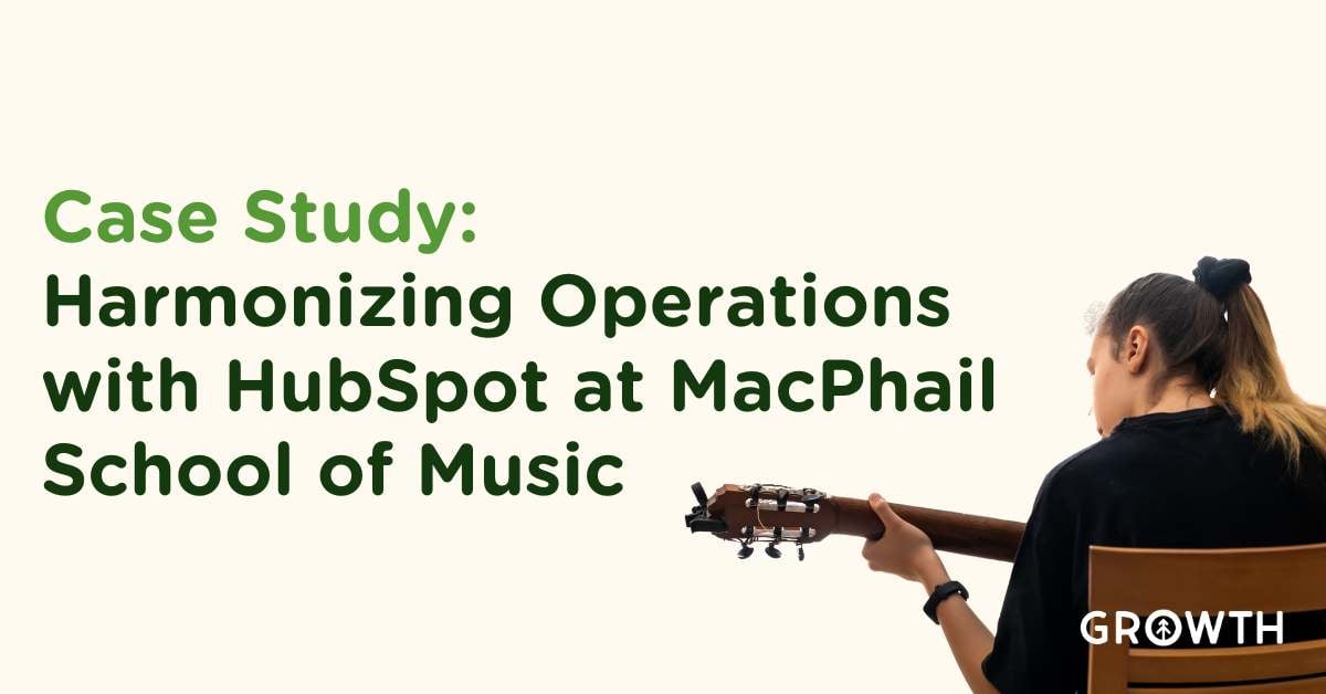
With Growth's help, Gateway for Cancer Research replaced a dinosaur Salesforce with HubSpot, migrating 256k records and achieving 100% team...
Read More
Through structured testing, issue tracking, and stakeholder sign-off, UAT ensures your organization enters launch with confidence, clarity,...
Read More
At its simplest, buyer intent refers to the digital signals prospects leave behind as they research problems, evaluate solutions, and move...
Read More
What our kickoff call includes, what you can expect from us, what we will need from you, and why this first meeting tends to feel different...
Read More
A practical planning and field-mapping guide to help RevOps, Marketing Ops, and Salesforce teams avoid sync issues, data conflicts, and...
Download Now
This post breaks down when to use HubSpot, when to use Apollo, how to integrate them correctly, and how to think about overlapping features...
Read More
This is a role-based HubSpot implementation checklist designed to help RevOps, Marketing Ops, Sales Ops, and HubSpot Admins successfully...
Download Now
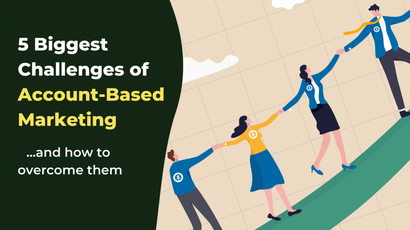
More than 70% of CRM implementations fail to meet their original objectives. Not because the software is bad, but because implementation is...
Access Now
This post breaks down how to design a two-layer scoring model that improves prioritization, pipeline health, and forecast accuracy without...
Read More
The data is becoming harder to track because the signals of "interest" are being automated. We’re fighting through a layer of digital noise...
Read More
If your leads are sitting in HubSpot doing nothing, this bundle will help you build the right nurture workflows and align marketing and...
Download Now
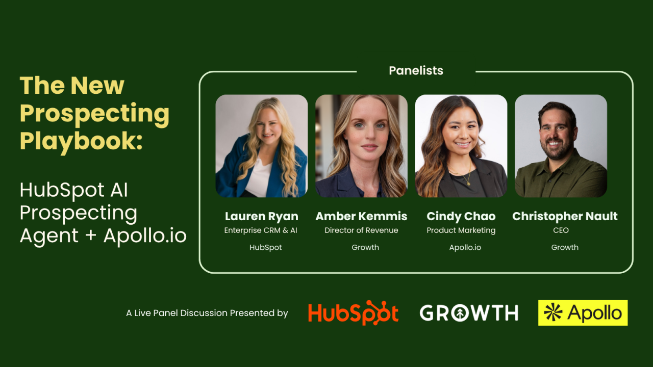
Join Amber Kemmis (Top 40 GTM Leader, 2025) for a hands-on walkthrough of how to transform HubSpot’s new intent and signal tools into...
Get the Replay
In this episode, Rich and Christopher discuss their recent experiences with AI tools, particularly within the HubSpot ecosystem. They share...
Listen Now
In this engaging conversation, Jill Fratianne, a seasoned sales professional at HubSpot, shares her journey and insights on the importance...
Listen Now
In this conversation, Nick Zeckets, CEO of Air Traffic Control, discusses the importance of content in ABM and the role of personalization...
Listen Now
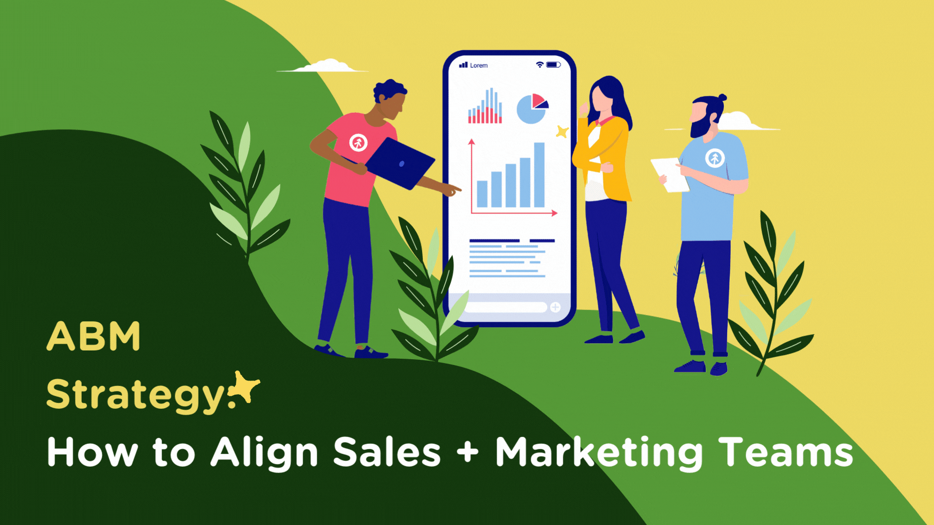
On today's episode of That's Growth Ops, Christopher Nault dives deep into Account-Based Marketing (ABM) with a focus on outbound marketing...
Listen Now
On today's episode of That's Growth Ops, Christopher Nault and Richard Walsh dive into successful marketing to millennials with an in-depth...
Listen Now
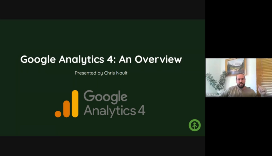
On today's episode, Richard and Christopher discuss their week, new features in Google Analytics and Canva, and the impact of website age...
Listen Now
In this conversation, the hosts and guests discuss various topics related to growth operations, including the importance of marketing and...
Listen Now
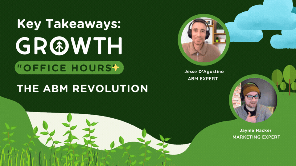
In today's episode, Richard and Christopher sit down with Jesse D'Agostino to explore the evolving landscape of growth operations, valuable...
Listen Now
Check out the replay from our lesson on: The Value Stream: Working with Key Players In The Value Chain with Nurit Aizenstros. Revisit your...
Read More
Check out the replay from our lesson on: Boost Sales Potential: Practical Use of Contact Segmentation in HubSpot with Lisa Freitas. Revisit...
Read More
Discover why soft skills like emotional intelligence, creativity, and adaptability are crucial in the AI era and how they complement AI to...
Read More
Uncover how HubSpot's all-in-one digital platform can drive growth and streamline business operations, websites, marketing, service & sales...
Read More
Explore the differences between Google Analytics and HubSpot tracking codes. Learn which tracking method suits your business needs better....
Read More
If you're like most marketers, you know there are a multitude of tools out there built specifically to help with certain aspects of inbound...
Read More
Blogging offers a wealth of SEO value to your website, which generates not just leads, but the right leads. Growth's list covers the top 4...
Read More
Every business experiences growing pains at some point. Here are some tips on how to remedy them so you can continue expanding your company...
Read More
Gathering and analyzing 1st-person data helps companies make more informed decisions about their products and services, ultimately helping...
Read More
Generating qualified leads is an important aspect of any company, so learning best practices for gathering information to qualify leads is...
Read More
Boost your SEO strategy with AI. Learn how AI impacts the four pillars of SEO - technical, content, on-site, off-site - and drives business...
Read More
The success of your website (+ your business) depends on identifying and utilizing the keywords your ideal customers use to search for your...
Read More
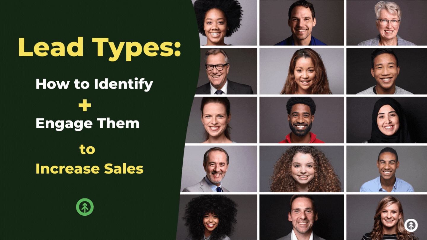
A major rule of pipeline management is that all leads are unique. Here, we drill down lead types for easy identification so you can engage...
Read More
Discover key highlights from INBOUND24, including advancements in AI, human-centric tech, and prepare for the anticipated INBOUND25 in San...
Read More
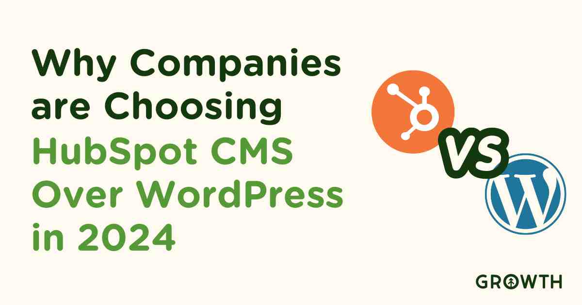
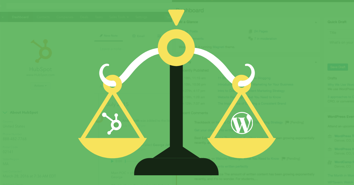
HubSpot and WordPress are powerful CMS platforms, but which system are you going to build your site on? We put them head to head so you can...
Read More
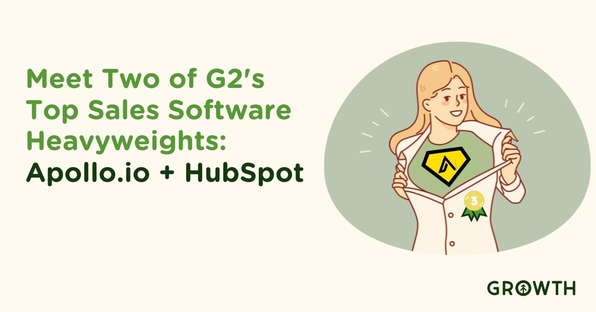
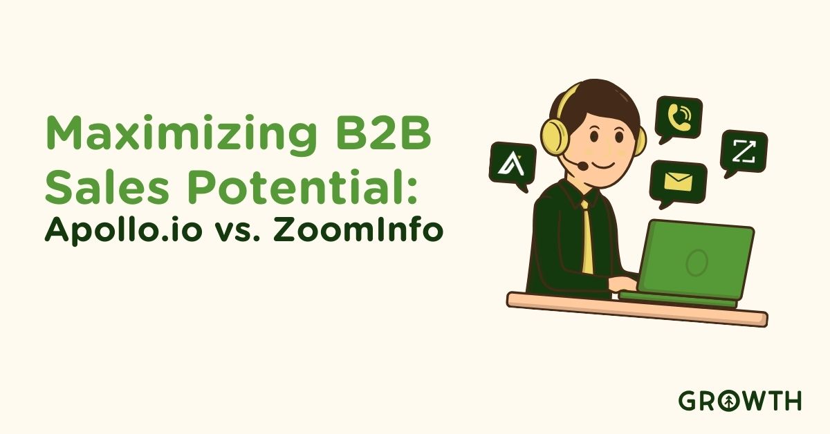
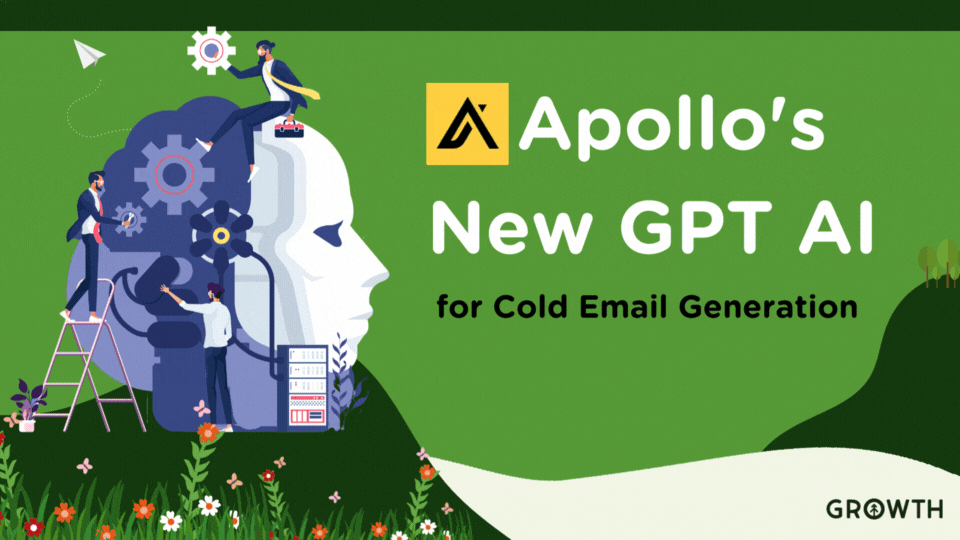
Discover how integrating Apollo.io with HubSpot enhances sales + marketing strategies and boosts business growth through sales intelligence...
Read More
Learn how to ensure HIPAA compliance with HubSpot for healthcare providers. Explore key requirements, best practices, and a case study for...
Read More
Learn how to connect your organization's LinkedIn profile (+ profiles of key members of your team) to your HubSpot Marketing Account (pro +...
Read More
Modern marketing teams have to be agile to keep up with the digital landscape, so choosing a lean team makes a lot of sense. Here's exactly...
Read More
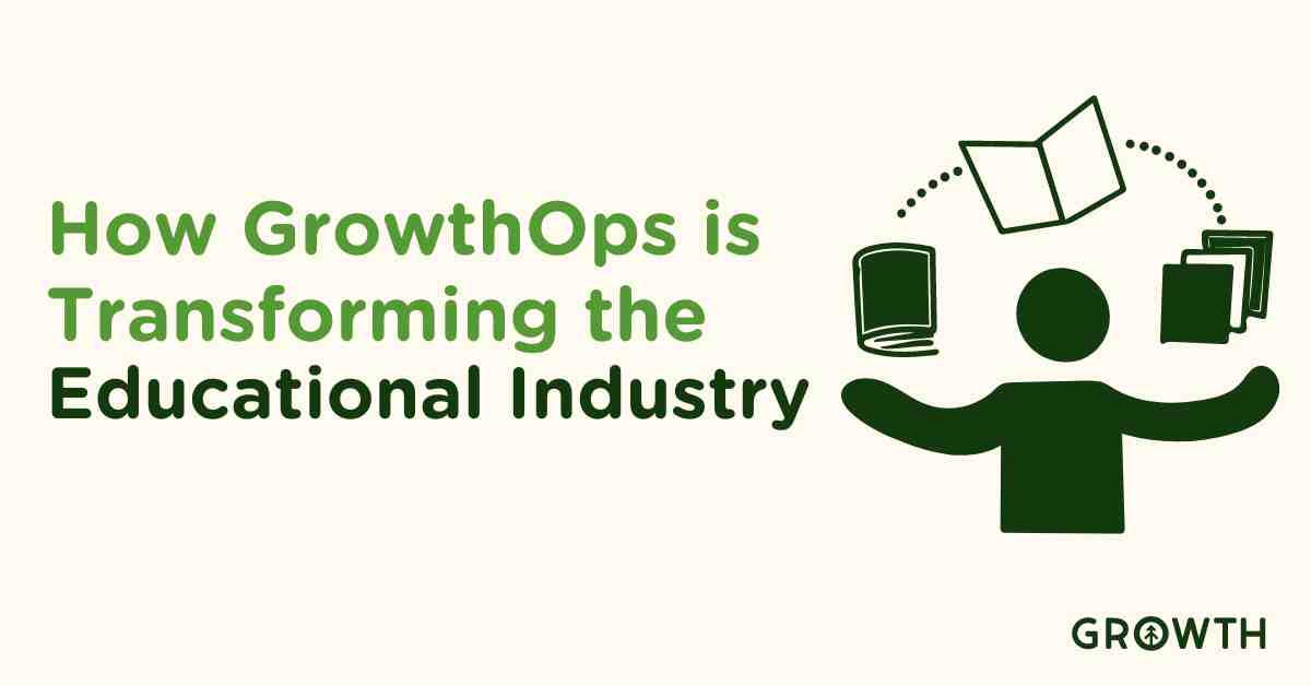
Discover how GrowthOps is revolutionizing the manufacturing industry by enhancing web presence, streamlining sales, and integrating ERP and...
Read More
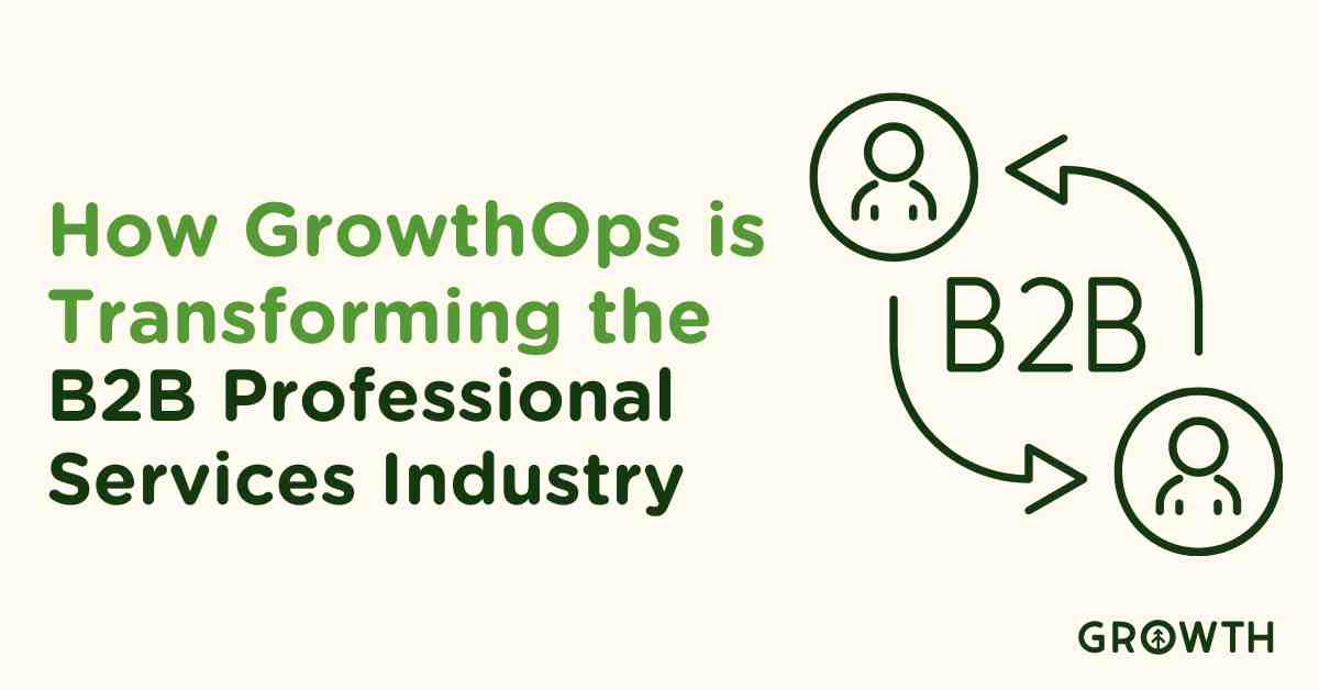
How GrowthOps is reshaping the B2B professional services industry by enhancing client relations, streamlining services, and integrating key...
Read More
Growth has been honored by our clients and UpCity as one of the top B2B service providers in Orlando. We won an UpCity excellence award for...
Read More
UpCity, a digital marketplace connecting businesses with marketing agencies they can trust, recognizes Growth as one of the top in Orlando...
Read More
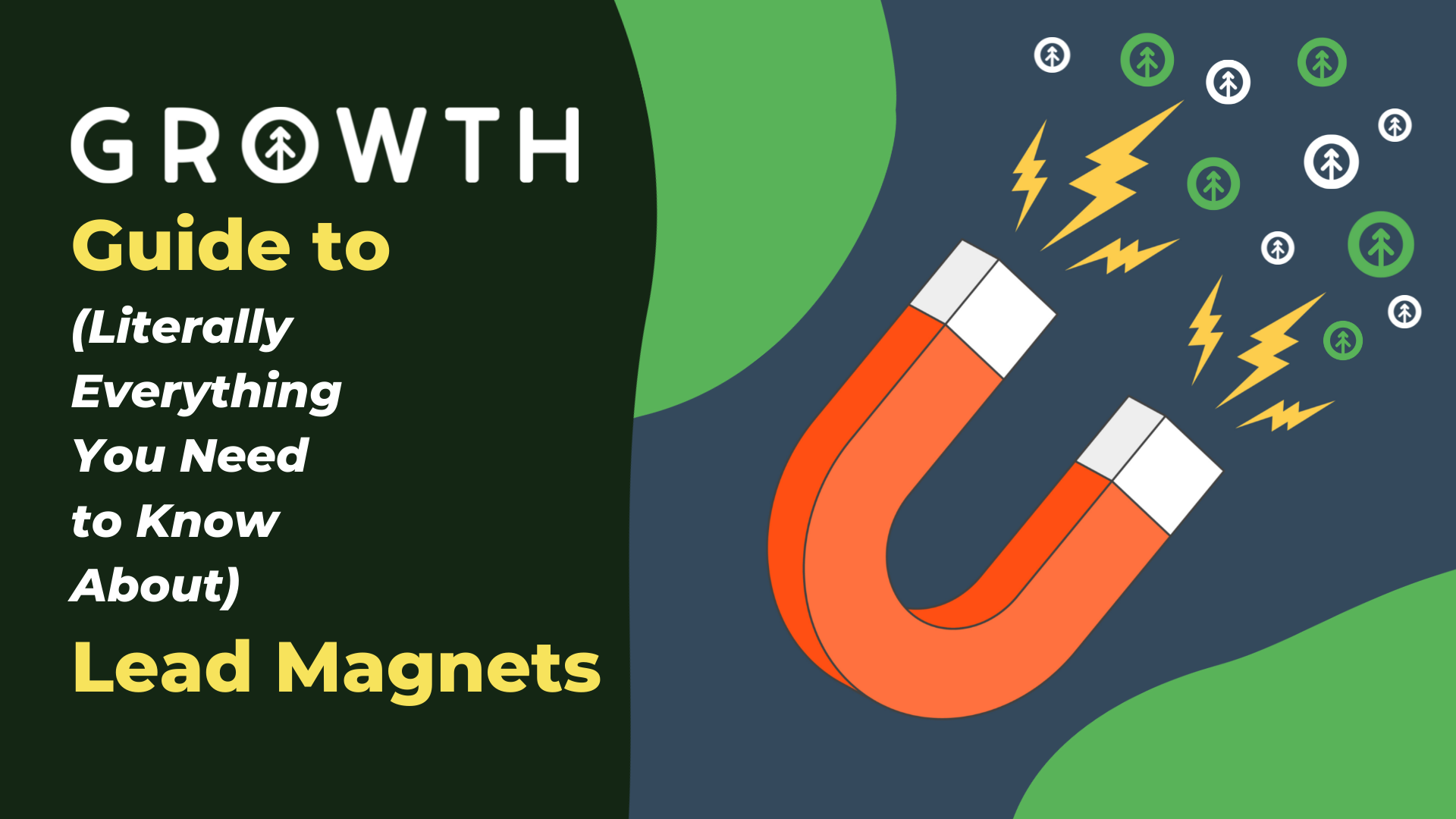
Building lead magnets for your digital marketing strategy is not as daunting as you might think. Check out our fast, easy guide for getting...
Read More
Keep your marketing team up-to-date on Google's Helpful Content Update. Learn what changes to expect and how it will affect your website's...
Read More
Creating high-quality, engaging content is one of the many factors that elevate the growth and success of your business. Find out how it's...
Read More
Slack is all about business communication. Whether your company is in-office or works remotely, we're willing to bet you could benefit from...
Read More
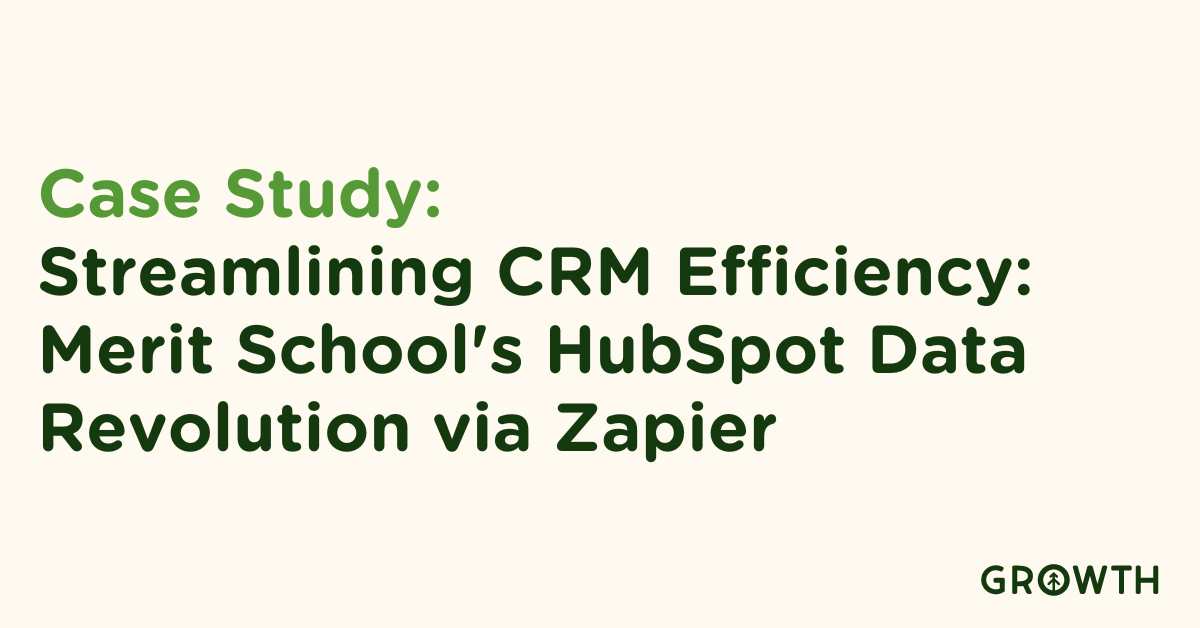
Discover in this case study how Merit School of Music's strategic use of Zapier and HubSpot revolutionized their customer data management,...
Read More
When you know your customer's goals, challenges, and preferences, you serve existing customers better and target prospective customers more...
Read More
We've all experienced ad fatigue while browsing the internet. Growth has a few helpful tips to avoid over-engaging your audience with your...
Read More
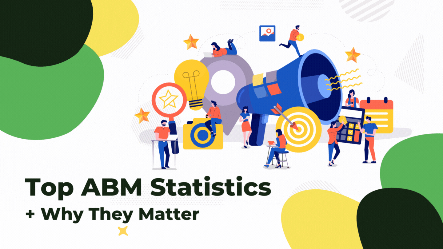
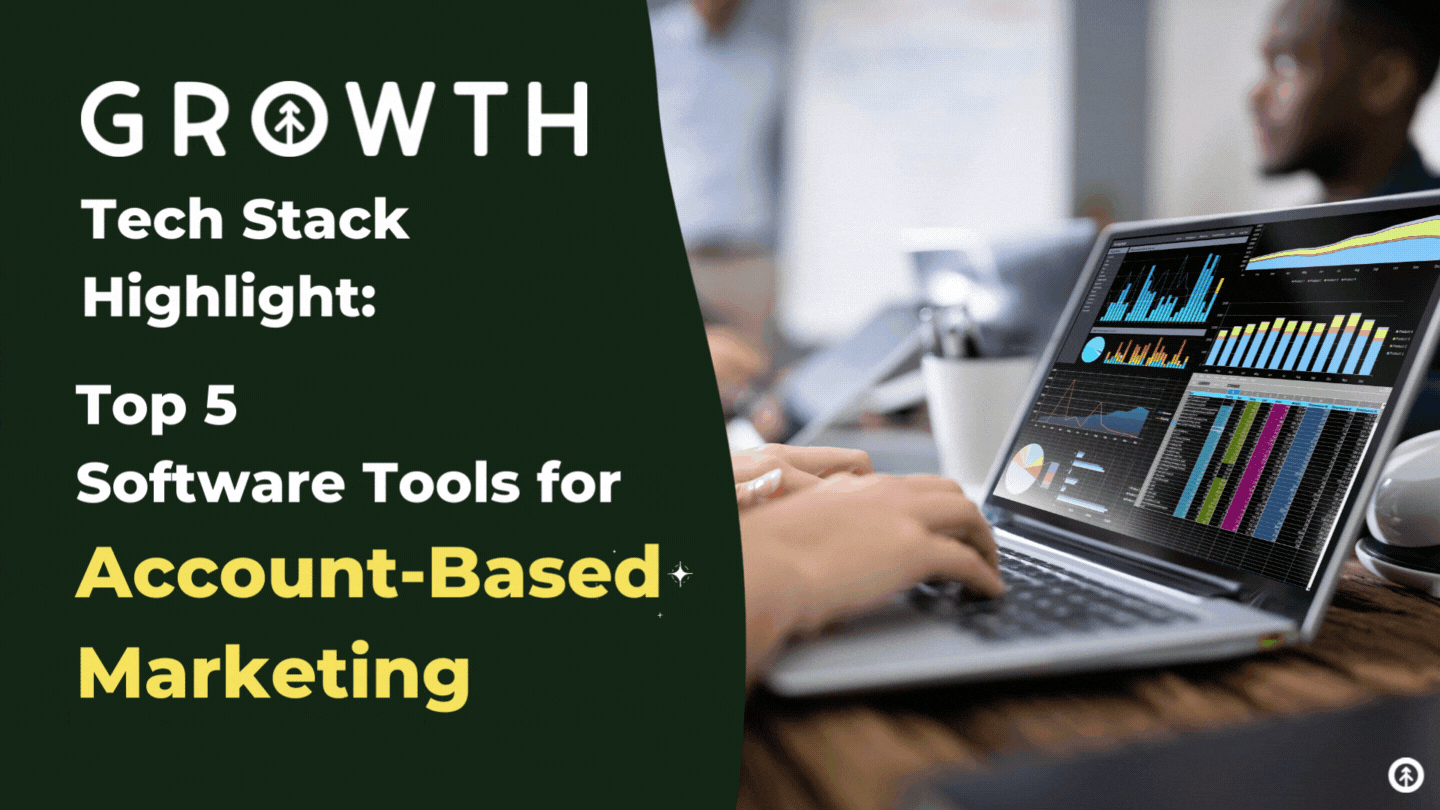
We've got a run-down on the top 5 tools in the tech stack you need to run an ABM strategy for your B2B business. They're Growth-tested and...
Read More
Where there are words in marketing, there's a copywriter still editing that copy in their head. Make it easier with 8 copywriting tips from...
Read More
Your landing page is the heavy-lifter responsible for converting your website visitors into leads, and we've got tips to help you optimize...
Read More
HubSpot's features are built to be engaging and delightful, but we have a few favorites that make for an amazing customer experience. Here...
Read More
It's simple. You want results, but you're not seeing them. That is the most direct and honest reason. If you need a few more reasons, keep...
Read More
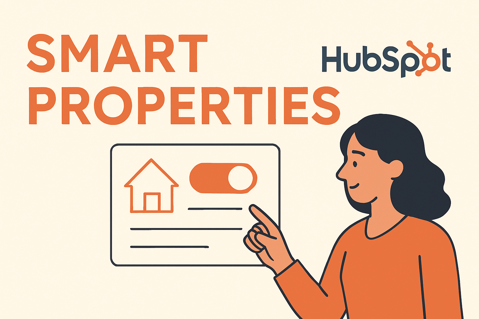
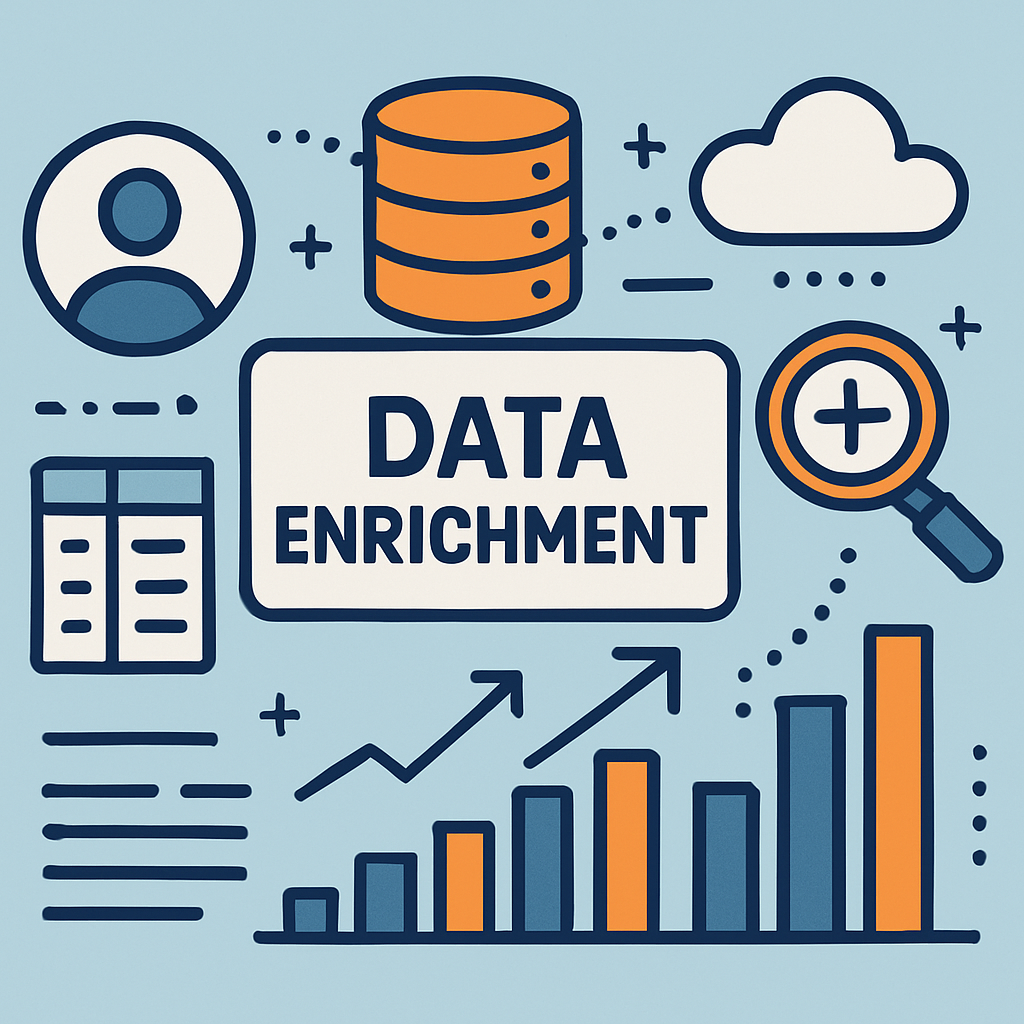
Discover Breeze Intelligence, the all-in-one data solution that enriches profiles, tracks buyer intent, and boosts engagement for smarter,...
Read More
Discover how to boost your B2B marketing with ABM using HubSpot and Apollo.io in our detailed webinar recap featuring expert strategies and...
Read More
Growth welcomes Nick Cull as our new COO. With deep HubSpot expertise and a long history with our team, he's ready to lead Growth into its...
Read More


.png)


.png)


.png)
.png)


.jpg)
.jpg)
.jpg)
.jpg)
.jpg)
.jpg)
.jpg)
.jpg)
.jpg)
.jpg)
.jpg)
.jpg)
.jpg)
.jpg)
.jpg)
.jpg)
.jpg)
.webp)

.jpg)
.jpg)
.jpg)
.jpg)


.jpg)